 Jumpino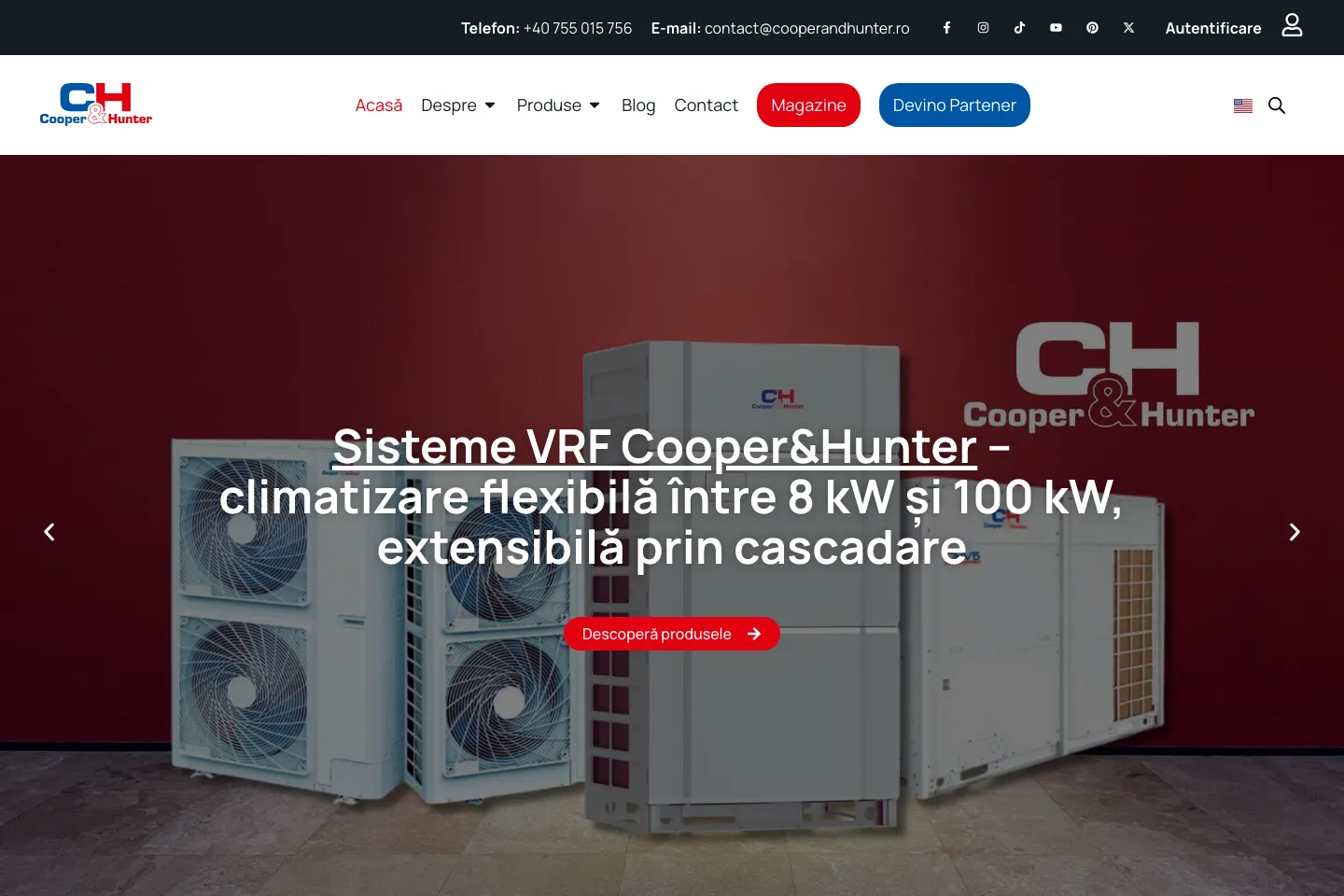
Updated
A technical catalog should help people find their bearings before asking them to get in touch. On the Cooper&Hunter Romania website, built through my ongoing collaboration with VMWeb, the product family provides that starting point.
Built through my ongoing collaboration with VMWeb.
Public website captures from 20 September 2026. The original website keeps its own language.
From category to product
The navigation separates air conditioners, multisplit and VRF systems, heat pumps, fan coils and ventilation. This helps visitors who know the problem they need to solve but do not yet know a model name. The homepage introduces selected ranges and links directly to products.
Different routes for different needs
Store and partnership links sit alongside the catalog as separate destinations. Someone looking for a dealer has a different task from a potential business partner. Contact information remains available in the main navigation and upper information bar.
What this project demonstrates
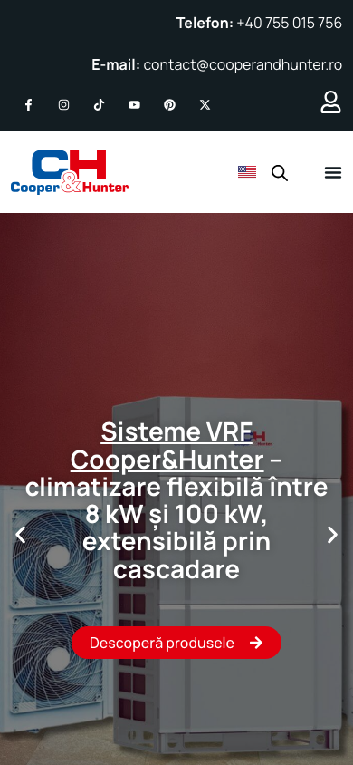
This is a website where content hierarchy matters as much as imagery. Categories provide the first map, product pages offer room for detail, and commercial actions have recognizable entry points. For a similar project, I would start with the product inventory and customer questions before deciding how cards should look. The screenshots show the public interface; they are not evidence of sales results or measured performance.
Working on something similar? Tell me what it needs to do.